
Five years ago, Michael Powell remarked to Poets & Writers Magazine that he wasn’t a fan of the way that the big chain bookstores like Borders had designed their interiors; he said these stores were “too bright,” with “shelves [. . .] so low [that] everybody’s watching everybody” (Jeremiah Chamberlin 2). The original store in Portland famously occupies a building that was once used by a car dealership, and the store’s aesthetic was originally “industrial,” as Powell put it, with “a cement floor” and “exposed insulation as a sort of architectural touch” (ibid).
This changed in a big way last year. Under the direction of Emily Powell, Michael’s daughter, and new CEO Miriam Sontz, the two most popular rooms in the City of Books, the Green and Blue Rooms, were remodeled (not to mention the building got a new roof). As one would expect, the new storefront reflects the trends that have taken effect in the book market since Michael helmed the independent chain. But this new arrangement could also be implying that the community surrounding Powell’s wished for its landmark bookstore to acknowledge these trends and incorporate them.
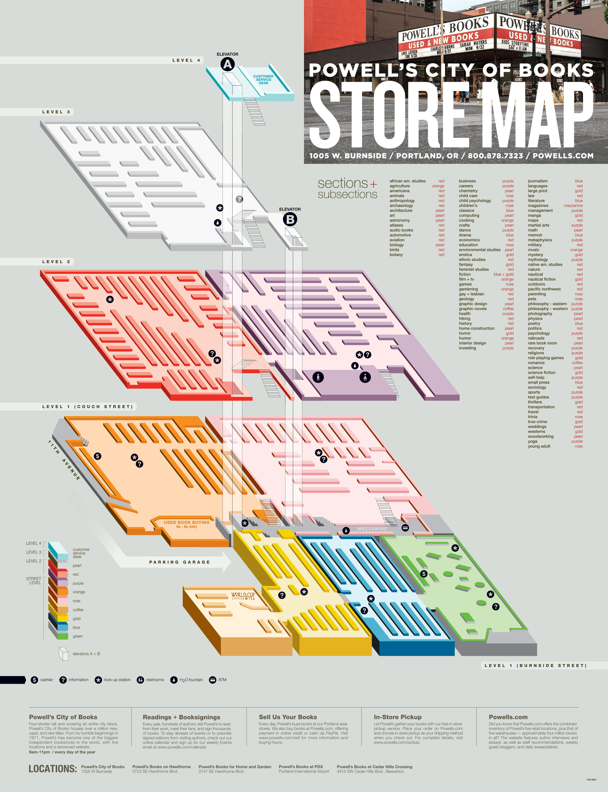
The drawing below is based off of a new Powell’s map, converting the diagonal view of the store to top-down. My drawing obviously isn’t the most sophisticated, but I found that it didn’t have to be–circles and rectangles both represent tables, except for search computers and the information desk, as seen in this photo; and the tables and shelves host the hottest titles on the market as well as the requisite accessories, souvenirs, and other impulse products.

But however large the Powell’s flagship store is, the company only has a handful of other stores. On top of that, a few of these stores have specialized, like the Home and Garden store. The point being that this independent chain does not have many stores to standardize and can still rely on local expectations. Just because it was ultimately decided that the front end of the City of Books could look more like the big chains doesn’t mean every branch has to.
Even so, the City of Books has retained a unique flavor. While the Green Room has become more quaint than the back areas of the store, it achieves this specifically by not being over-bright like the Borders outlets that felt so uninviting to Michael Powell. If you look at the image of the cashiers’ counter again, you’ll see that the colors in the picture are all very mild and muted. The light-tan shelves and the matte white wall behind the cashiers blend together so that only the green banners advertising New Arrivals and a nerdy neologism call attention to themselves.
 In the Thinglink image above, I observed more than once that there’s a lot of space to move around in with this new design. While it’s hard to find images online that could definitely be said to have represented the Green Room pre-2014, many of these older images show massive shelves standing very close together. In fact, they seem to show rooms other than Green or Blue, given the color coding on the signs, meaning that those rooms are likely the same at this very moment. In other words, much of the store has kept its independent stock and feeling–you just have to look past the bestsellers. And with Powell’s’s eminence as an independent, there’s sure to be many customers who can walk past the New Faves table-island without even a first glance.
Not to mention that the Green Room itself hasn’t even been completely standardized. While the tables in the middling space of the room are as short and unassuming as the ones in chain stores, the shelves on the walls are still very tall and well-filled. If the City of Books has aired itself out a bit, it is no shier about the breadth of its contents. In fact, I would say that the combination of walking space and high stock gives the store a feeling of confidence and opulence that can’t be achieved with clustered shelves. Even with the hot titles that every other bookstore also carries, Powell’s shows that it can compete with any chain outlet.
Lest we say too much to the effect that too little has really changed, I want to call attention to a smaller detail in the new Green Room. If you go back to the floor plan, you can see that the small tables all have space underneath for more copies of the displayed titles to be stacked up. I don’t know who first worked out such a table design, but it’s genius. Anyone browsing the wares can take a book without messing up the display, if they so choose, and they can also make note of diminishing stock.
This design is anathematic to the independent booksellers of old, who stood against the commodification of literature under the belief that it could not be quantified or exhausted in the same way as, to use Len Riggio’s example, toothpaste (Miller 97). However, the beauty of these tables is that store managers now get to have it both ways. They get to show books as “gallery objects” and “huge piles” at the same time (ibid). To use another concept, a book on this shelf exists as “the celebrated Thing,” the item bearing “its rich set of connections,” that philosopher Martin Heidegger sought in contrast with “objects” (Bruno Latour 2288). Books in and on these tables are universally meant to be read, but art can’t ever be “abandoned to the empty mastery of science and technology” like mere objects can; each book, when read, deepens feeling within a reader regardless of the way it stood on its shelf, the number of souvenirs on the next shelf, or the amount of space traversed to find it (ibid).
Images
Images of Powell’s City of Books found through Google searches.
Texts
Latour, Bruno. “Why Has Critique Run Out of Steam?” The Norton Anthology of Theory and Criticism. 2nd ed. Ed. Vincent B. Leitch. New York: W.W. Norton & Company, 2010. 2282-302. Web.
Miller, Laura J. Reluctant Capitalists: Bookselling and the Culture of Consumption. Chicago: University of Chicago Press, 2006. 87-115. Print.
Websites
Inside Indie Bookstores: Powell’s Books in Portland, Oregon
Overview of changes according to Powell’s
Before changes were completed (Portland Monthly Mag)
0 Comments